Providing a smooth and easy experience on your website is crucial to keeping bounce rates low and customers happy. So, how can you accomplish this?
Your website is your home base, so it’s important to have a strong and informative landing place for visitors to interact with your brand. A strong user experience (UX) can lead to conversions—but only if people are happy with your site and want to continue interacting with your company.
If your site isn’t properly optimized, 79% of people will search for another place to complete their task. How can you make sure that doesn’t happen? Check out some of our tips on UX design optimization.
What is User Experience?
Overall, the user experience is about the physical and psychological feelings a person has before, during and after using a product, system or service. So, relating that to a website’s interface is important in maintaining positive feelings about your product or service. User experience is all about understanding the user and what they want out of a website.
People want to have access to information quickly and conveniently, and you want them to use your website as a resource. And to make their experience a positive one, optimizing your design will create a website that is an easy-to-use tool for clients.

The Design Aspect
A beautifully designed website shows that your company is trustworthy and cares about its public image. Over 38% of people have said that they will stop engaging with a website if the content or layout is unattractive.
We’re sure you’ve seen a wonderfully designed website, but what are the elements that make a website stand out for its design and interface?
Homepage
People still judge a book—and a website—by its cover. A homepage should let visitors know right away who your company is and what it does. It should be inviting and clearly lay out the important information. Your message and contact information should be readily available for visitors.
Keep the design clean and clear—visitors want to see the call to action. Tell your visitors why they should be on your homepage and not someone else’s with a description of exactly what your company has to offer. Viewers should be able to easily navigate from your homepage to other pages, as well.
White Space
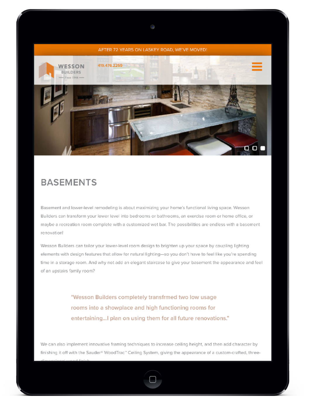
White space is the negative area between text and design. Simply put, it’s the space where there’s nothing, and having nothing is an important element to design. Leaving purposeful blank space allows viewers to focus on one piece of content easily, helping them to understand and retain more information about your brand. Research has found that using white space to highlight important elements on a website increased comprehension by almost 20%. An appropriate use of white space can make text feel approachable instead of like a daunting research paper. CG designed wessonbuilders.com using white space and clean design to bring focus to the information and images that matter.
Imagery
Images are crucial to breaking up chunks of text, are more memorable and help to reiterate points made by copy. If information is paired with a relevant visual component, people will retain up to 65% of the information three days later as opposed to only 10% with text alone.
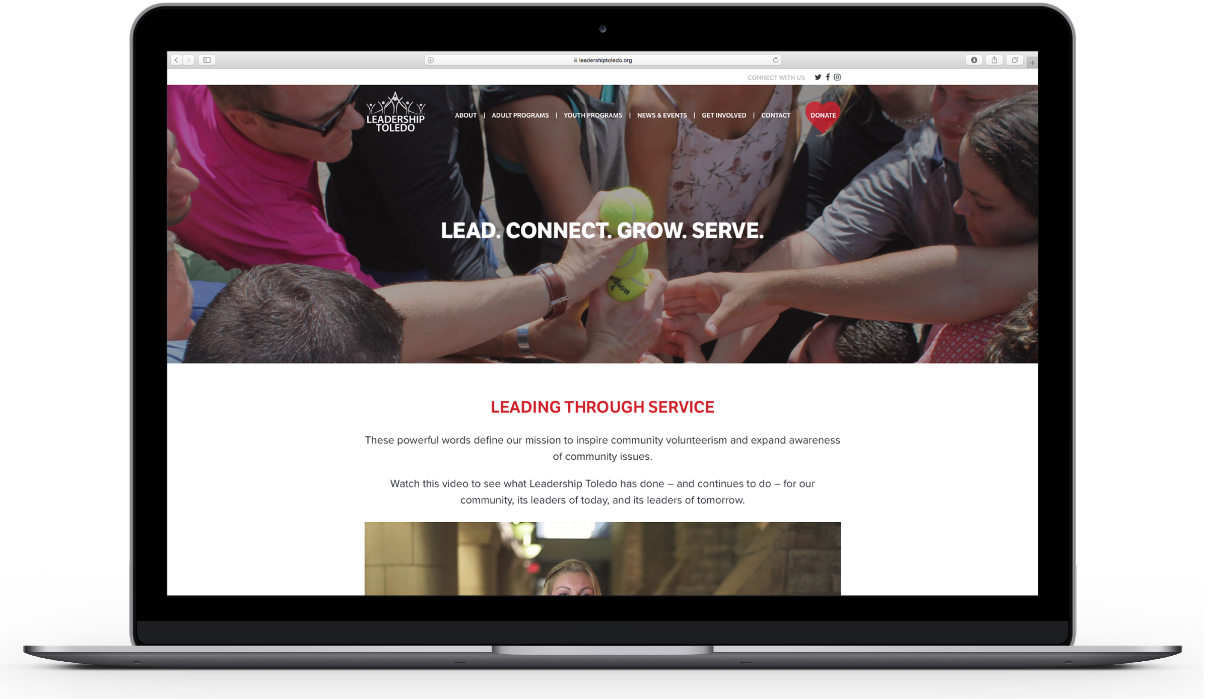
Humans are highly visual creatures and process visual information very well, and images can be very powerful in capturing a viewer’s attention, conveying more emotion than text. As more and more information becomes available online, more brands and companies will be vying for potential customers’ attention. Make people want to visit your site and read your article by enticing them with compelling and appropriate images, like on leadershiptoledo.org.
Headings
Headings help to break up text into manageable chunks of readable information. They make your website and blog easy for people to navigate and less intimidating to read, like in the case of spicerparts.com.
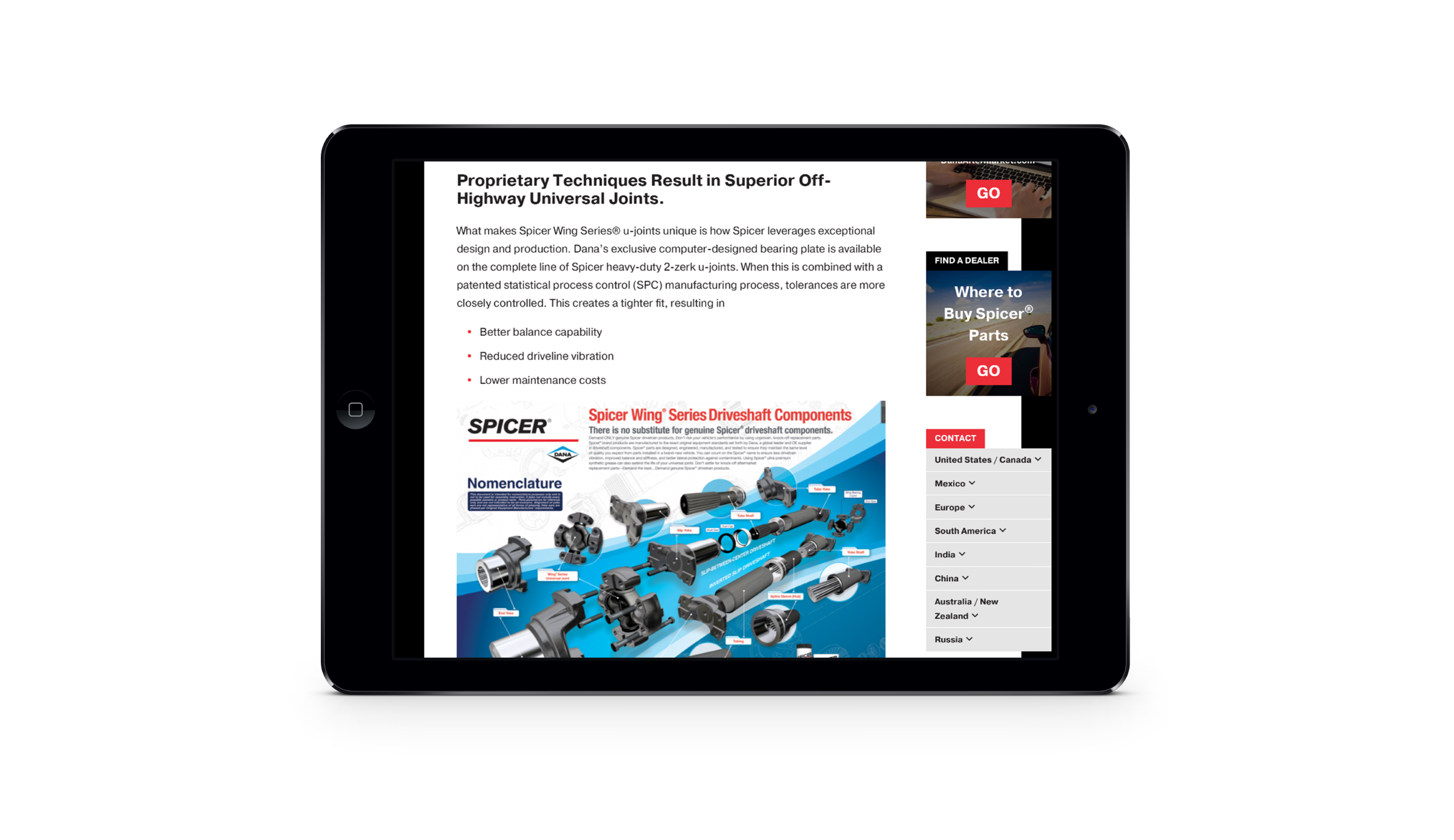
People are trying to quickly find information, and headings and subheadings help them to do that. Truth be told, people are only going to read a fraction of what you write. Time is valuable to people—don’t waste it. Help them find the information they are looking for so they don’t turn to another source.
Identify the Call to Action
Your website should help people easily move around and identify what their next step is. Whether it is to buy now, learn more or contact you, the reader shouldn’t be left wondering how to proceed in working with your company.
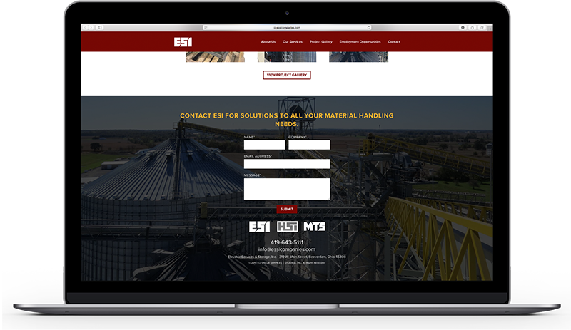
Guide readers to your call-to-action (CTA) without effort or thinking on their part. Make them want to have what your company has to offer by promoting your ideas, followed by a clear-cut follow-up action. ESI’s new website includes a CTA in the footer of every page, so visitors can easily contact them from any page.
Mobile Optimization
Search engines now take into account mobile accessibility as part of their ranking process. With more websites being accessed on mobile devices than on desktop, it’s important to consider the UX on a mobile device. Research by Google says that 61% of users are unlikely to return to a mobile site if they had trouble accessing it the first time.
The content on a responsive website should automatically adjust to display in a simple, one-column format on mobile so visitors don’t need to “pinch and zoom” in order to read it. The most important information should be prioritized by putting it at the top. Remember to have a minimum of 40 x 40 pixelspace for buttons on the screen.
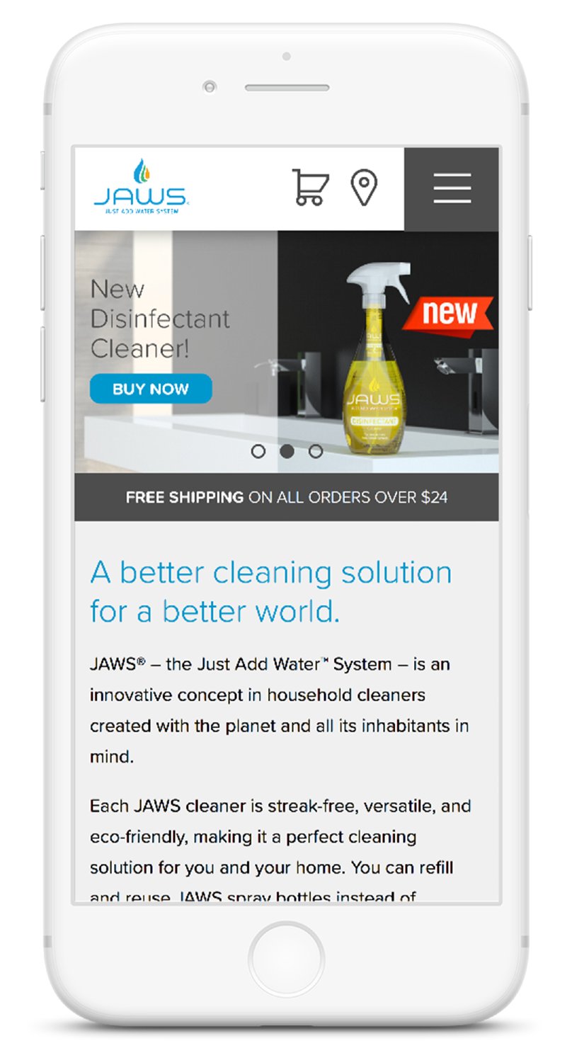
Minimalism is also important to mobile sites, especially with a smaller screen size. The navigation bar should include only essential navigation items, typically by employing a menu icon that expands to show the full list of menu options. Calls-to-action should be emphasized and clear to make for a successful user experience. In designing the jawscleans.com mobile menu, CG made sure to optimize it with a simplified navigation bar that highlighted the essential information—the shopping cart and store locator.
Loading Speed
53% of mobile sites are abandoned if the page takes more than 3 seconds to load, and 47% of users expect a web page to load in two seconds or less. Websites might have a lot of information to load, but it’s important to ensure the content is optimized to load quickly. This is key for both desktop and mobile sites as more and more people are accessing web pages on their smartphones.
To decrease your site’s loading time:
- Minimize HTTP Requests: Combine CSS or Javascript files into one larger file to stop the browsers from trying to retrieve multiple files.
- Optimize Images: Images take a lot of time and energy when it comes to loading a webpage. Scale or compress your images appropriately so that they load quickly.
- Browser Caching: Once users visit your page, browser caching will allow for assets on your website to be downloaded into a temporary storage space on users’ computers. This will decrease loading times because these files will not have to load each time they visit your site.

Let’s Optimize Your Site
Optimizing your website for customers will improve your conversion rates and your customer satisfaction. At Concentrek, our team of developers and digital designers can build a new site that best suits your brand—and aligns with these best practices. Let us help you elevate your online presence today!

